
Evaluating TradeMe’s help centre content
Content Design and User Research
Project overview
As part of my Master’s degree capstone project, I had the opportunity to work with TradeMe, New Zealand’s largest online marketplace, to evaluate and improve their Help Centre content. My primary focus was on enhancing content comprehension, discoverability, and minimising cognitive load, ensuring that users could efficiently resolve issues on their own. Over the course of three months, I conducted two rounds of user testing, exploring a variety of testing methods to understand how users interacted with and understood TradeMe's Help Centre.

Research question
How might we improve the comprehension, discoverability, and cognitive load of TradeMe’s Help Centre content?
To answer this, I investigated how users find and understand information within the Help Centre, using a variety of user testing techniques, including a unique "toe-tapping" cognitive load test designed to simulate mental stress.
Context and business need
TradeMe's Help Centre had not been updated in over two years. It plays a critical role in helping users resolve issues while reducing the load on the customer service team. The company aimed to improve its self-serve functionality, aligning with research by the CX team that indicated users prefer solving problems independently. This project aimed to enhance usability and ensure consistent, high-quality content by focusing on information architecture and content clarity.
Project focus areas
Initial Impressions: Understanding users’ first impressions of the Help Centre content.
Usability Issues: Identifying problems within the Help Centre, particularly with the search functionality.
Language & Keywords: Exploring the language and keywords users rely on when troubleshooting issues.
Navigation: Observing how users navigate to and through the Help Centre.
Content Comprehension: Determining if the content is easy to understand and effectively solves users' problems.
Research methodology
Process
The research process included multiple steps, which I completed independently:
Interview stakeholders
Conduct desk research
Design and run Round 1 of user testing
Analyse Round 1 results
Design and run Round 2 of user testing
Analyse Round 2 results
Present findings to the team
Testing Methods
I used a variety of testing techniques to assess comprehension, discoverability, and cognitive load:
Cloze Test: Participants completed missing words in a piece of content to measure comprehension.
Highlighter Test: Users highlighted unclear text in red and clear text in green, helping identify confusing language.
Preference Test: Participants were shown several variations of content and asked to choose the most effective, identifying design elements that resonated with users.
Tapping Test: To simulate mental load, users tapped their foot while completing a task. This test gauged the cognitive strain during the search for information.
Navigation and Information Architecture: Users were given a problem scenario and asked to navigate the Help Centre to solve it. This helped assess the structure and flow of content.

Participants
I conducted user interviews with 9 participants, ensuring a diverse group in terms of age, digital literacy, and language preferences. This included one participant who browsed the web in Te Reo Māori and another who had moved to New Zealand only the previous year.
Key insights
Clarity of subheadings
Users want subheadings to clearly reflect the content underneath them. Misleading or vague subheadings cause confusion and lead to wasted time searching for the right information as their eyes skim the page using the subheadings to find relevant content.Consistency in navigation and information architecture
Users expect consistent navigation and a clear information structure throughout the Help Centre. With each new page, the format of the page changes, even switching placement of navigation menus. This adds to cognitive load and confuses users, making it harder to find the information efficiently.Help centre placement and visibility
Users expect the Help Centre to be at the top of the homepage for quick access. If it is not placed prominently, they may struggle to find it, leading to frustration and potentially abandoned searches for help.Search function and language barriers
Users often have difficulty navigating the Help Centre's search function because they need to predict how Trade Me will phrase their issue. This can lead to frustration and reduced efficiency when trying to find relevant solutions as they struggle to match TradeMe jargon.Content categorisation and visuals
Users appreciate the helpful categorisation of content and the inclusion of icons and images in the Help Centre. Clear organisation and visual cues make navigation faster and more intuitive, improving overall user satisfaction.Preference for direct contact over bots
Users prefer direct contact with a human representative over interacting with a bot when they cannot solve their issue. The lack of easy access to a person may lead to dissatisfaction and a negative perception of the support experience.Self-sufficiency and use of external search
Some users prefer to solve problems independently before seeking help, and others use Google to find answers. This behavior indicates the importance of having solutions readily available both on the site and via search engines.General sentiment towards the help centre
Overall, users like the Help Centre and find it helpful for resolving issues. This positive sentiment suggests that while the Help Centre is effective, there are opportunities to further improve its design and usability.Clear and Concise Language
Users appreciate the Help Centre's clear, concise, and straightforward language. If the language becomes too complex or unclear, it can hinder understanding and increase frustration.

This sub-heading didn’t accurately reflect the content below it, which caused participants to miss important information.
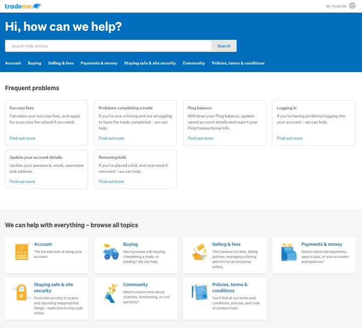
1. The homepage of the Help Centre – note the use of cards to organise the content for discoverability.

2. The second level of content in the Help Centre, where the design of the content cards is different to the homepage.

3. The third level of content in the Help Centre, where the navigation switches to a left-hand menu.
Reflection & lessons learned
This project provided valuable insights into the complexities of content design and user research. One memorable learning moment was the inclusion of the "tapping test," suggested by TradeMe’s Head of Research. It was a unique approach to measuring cognitive load, which deepened my understanding of how stress affects usability.
I also was not expecting the 3-week lead time for participant recruitment, which threw off the timeframes and deadlines. This was challenging because I intended to run 2 rounds of user testing, and needed to decide what I wanted to test, with who, and how, 3 weeks in advance, which wasn’t easy when I was still working on the analysis phase and uncovering insights from my first round of testing.
This project also taught me that not every research method is necessary to gather useful data. While my initial project brief included multiple methods, I later found that I could have obtained similar insights with fewer techniques, which has made me more efficient in future projects.
Closing thoughts
Looking back on this project 4 years later I feel both pride and compassion for the baby UX designer that I was! My classmates all completed their capstone projects in groups, while I did all of this work on my own, and I still put a lot of pressure on myself to complete the same amount of work within the same timeframe that they did.
With experience, I recognise that I did not necessarily need to do all of the steps that I did to get the same quality of customer insights (and the initial project brief I wrote included twice as many research methods as I eventually ended up doing), and I have since adapted my methods to uncover robust data for product teams who usually want answers fast, with minimal resources.